Ricochet
Designs
Reframing spent ammunition as a refined, contemporary jewellery brand.
Ricochet Designs is an independent jewellery brand founded in 2022, creating handcrafted pieces from recycled spent ammunition cases.
I built the brand from the ground up — shaping the visual identity, website, social presence, marketing materials, SEO and communication across both customer and retail-partner touchpoints.
A brand system built around contrast.
The identity combines expressive blackletter-inspired branding with restrained layouts, editorial typography and a limited colour system — echoing the contrast already present in the jewellery.
Wordmark · Monogram · Typography · Colour · Layout · Photography



Aa
Ricochet
A second life for discarded material.
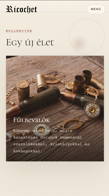
Designed as a brand experience, not just a catalogue.
The website combines product discovery with storytelling. Editorial typography, warm imagery and a clear content hierarchy explain the material and philosophy behind the pieces while keeping navigation simple and product-focused.
Information Architecture · UI · Responsive Design · Frontend · SEO
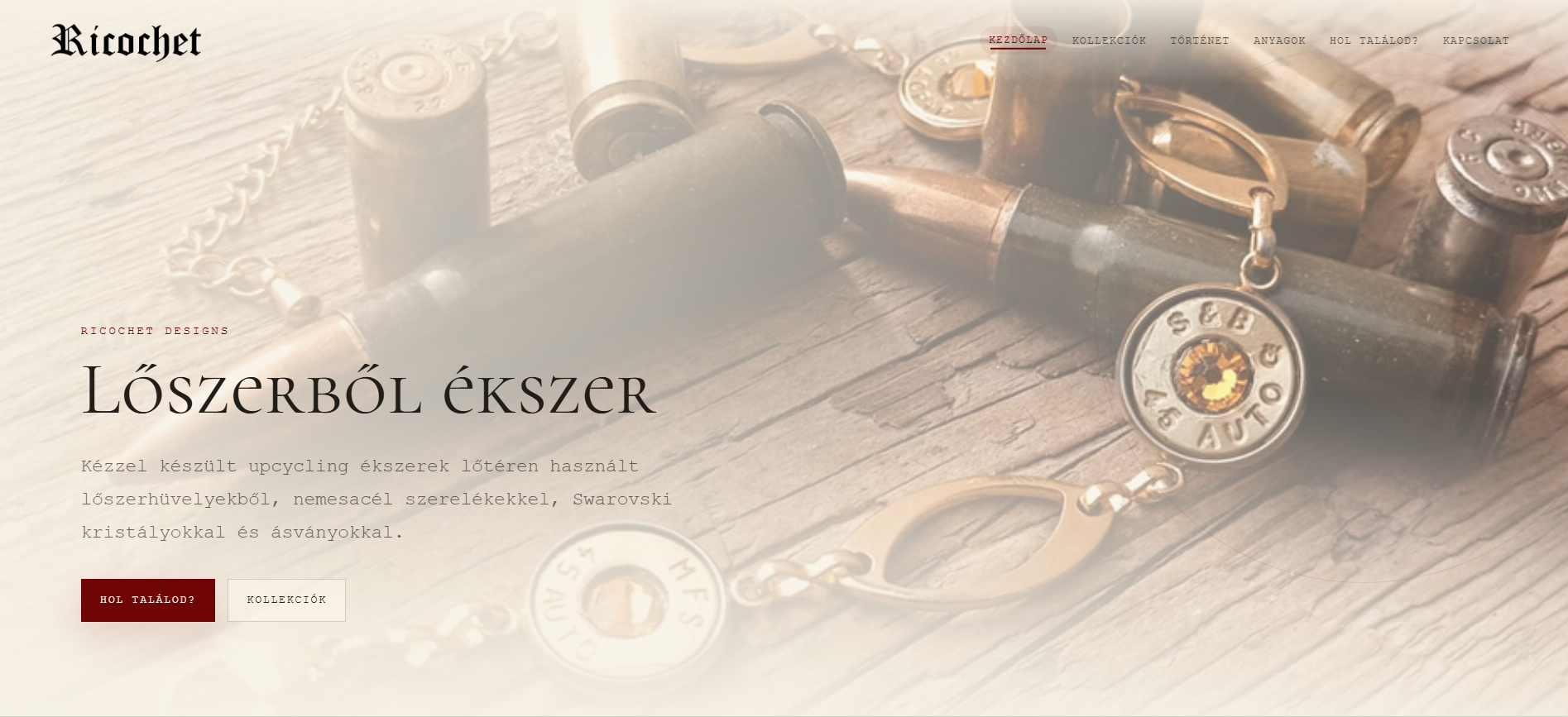
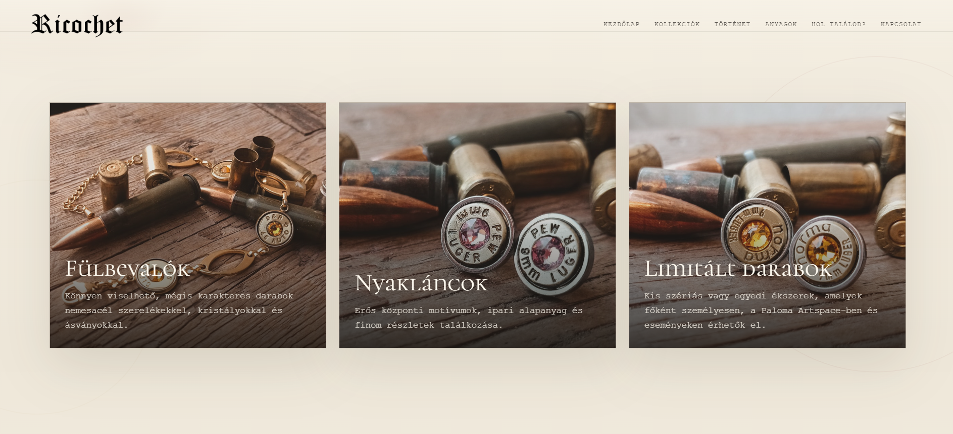
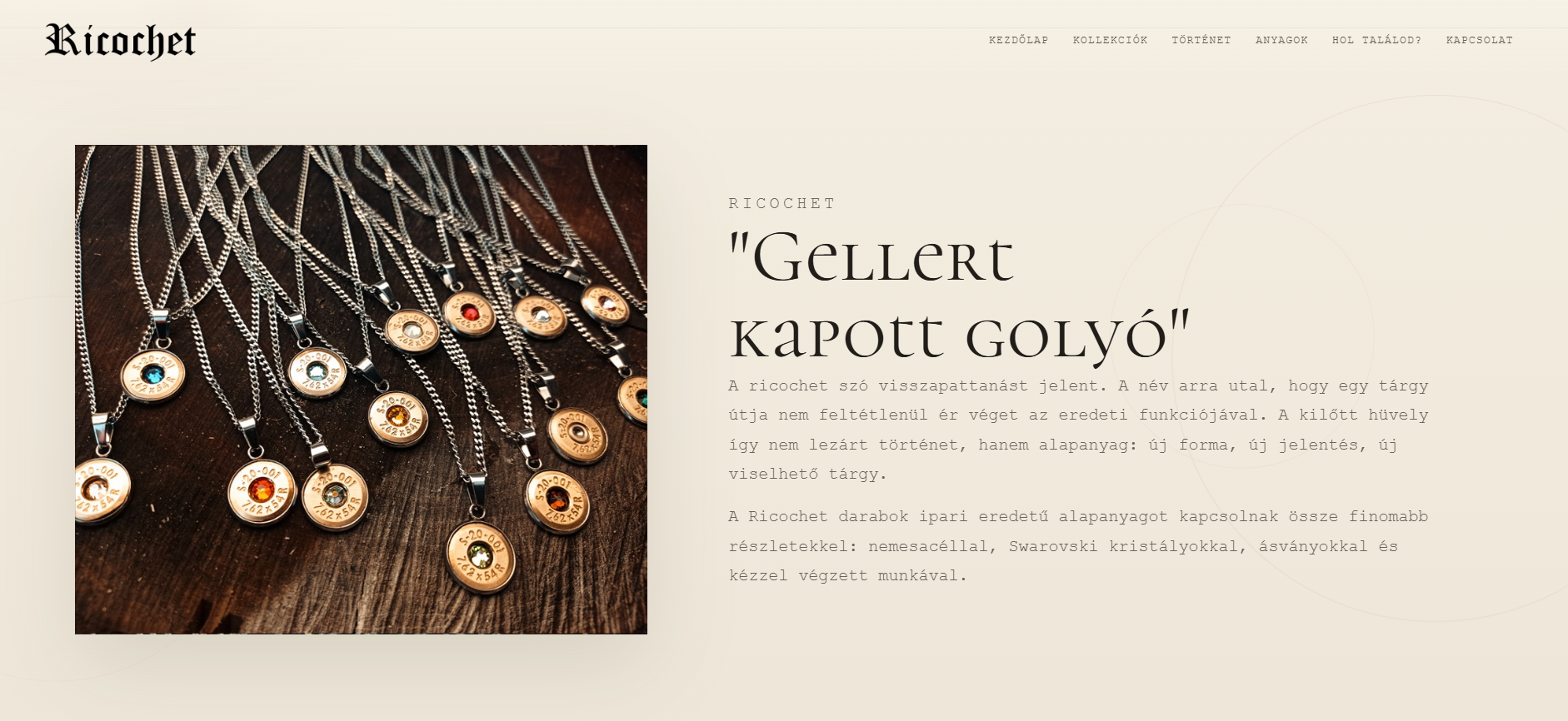
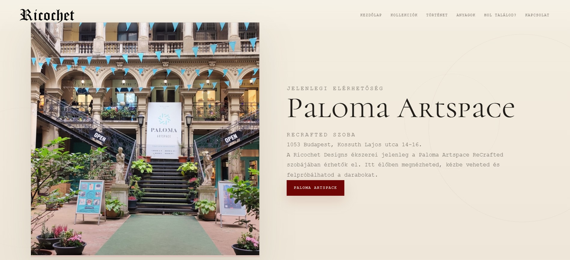
Built to move between digital and physical touchpoints.
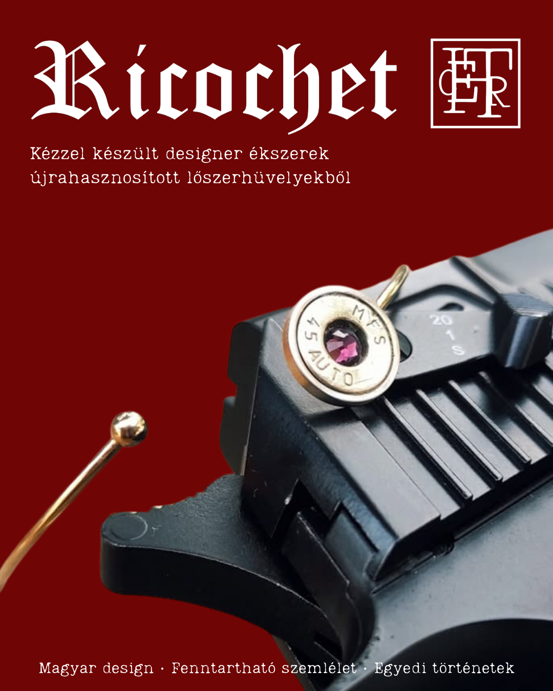
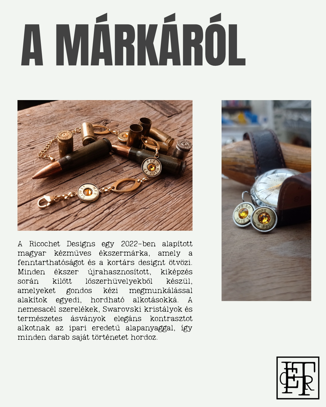
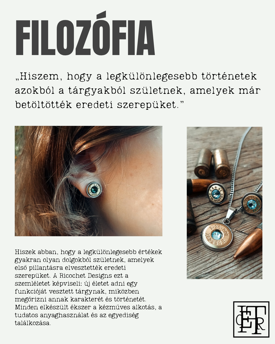
The identity extends from the website into printed material and compact brand applications, keeping the system recognisable at different scales and levels of information.
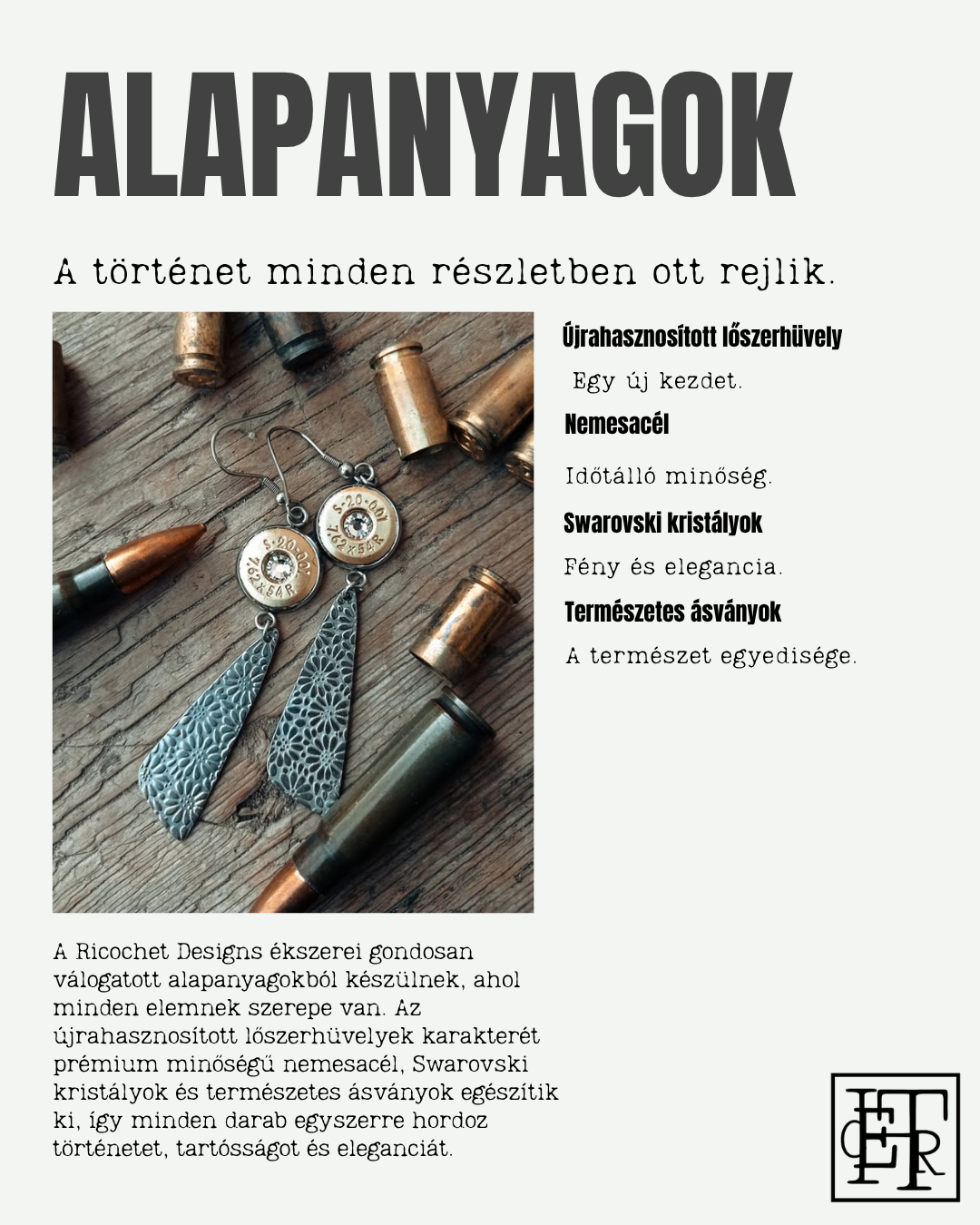
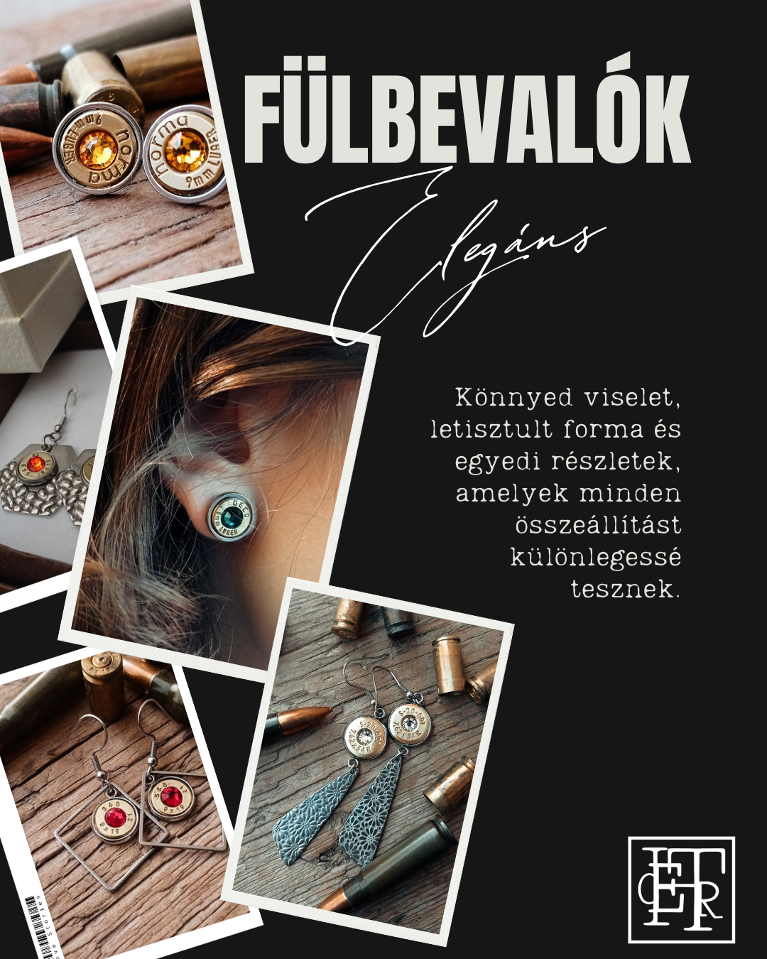
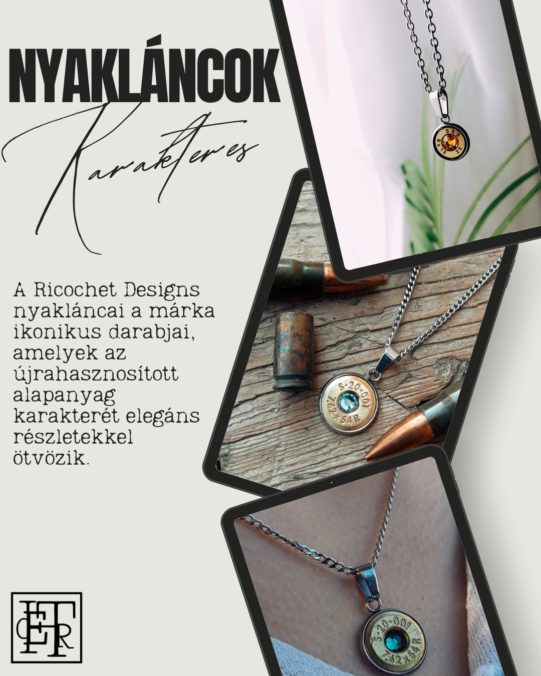
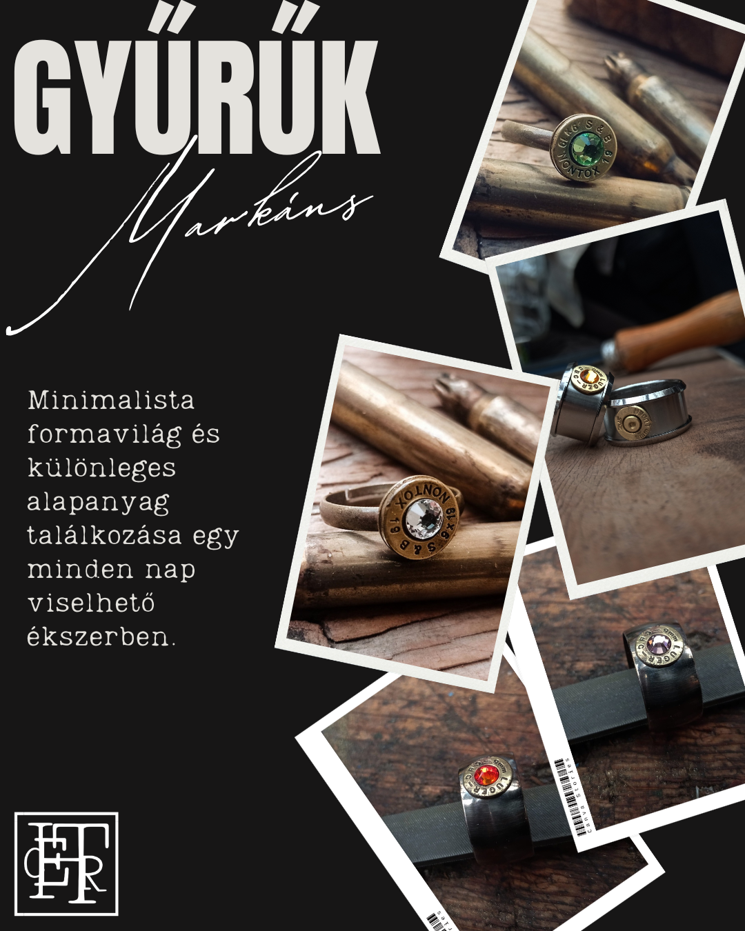
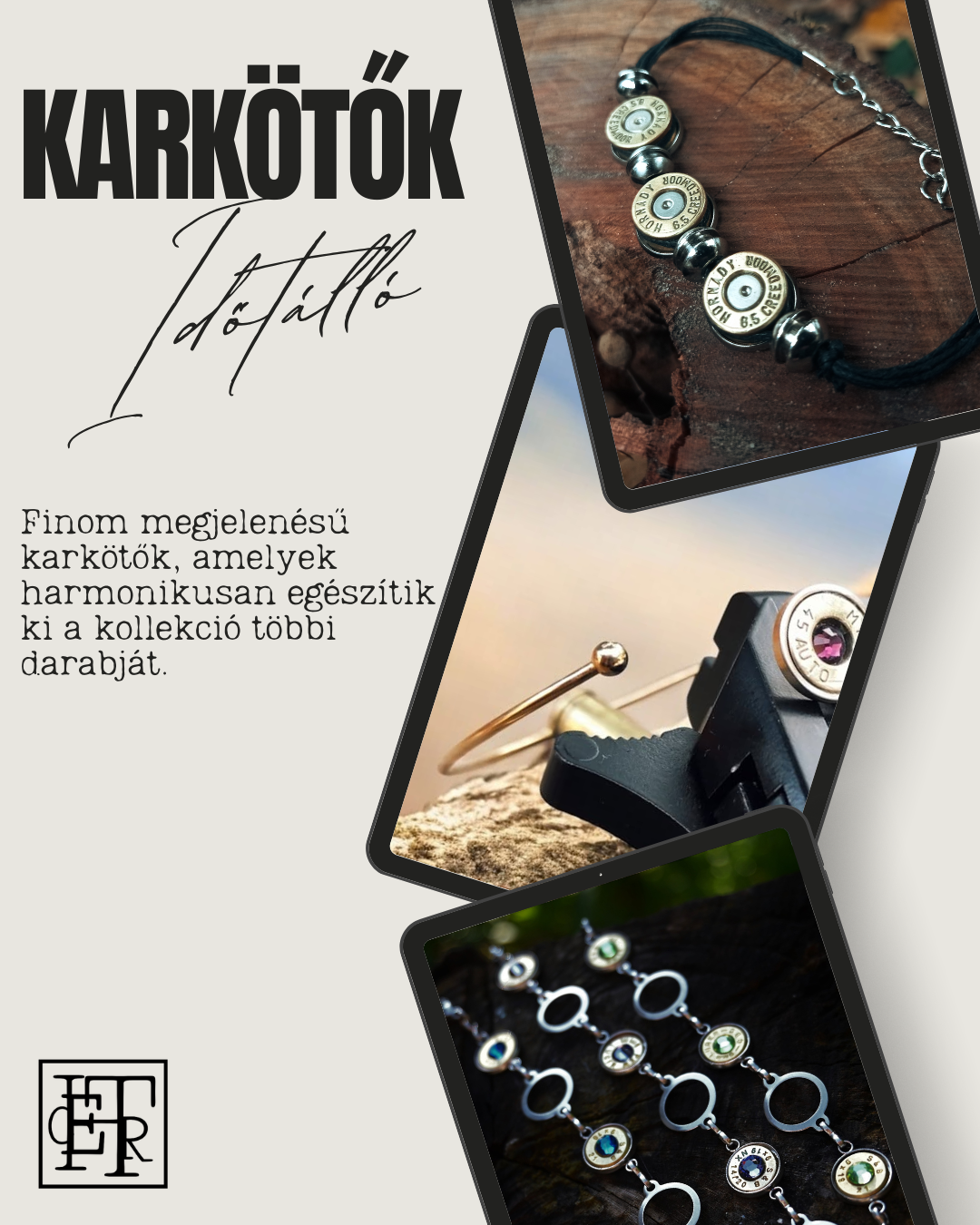
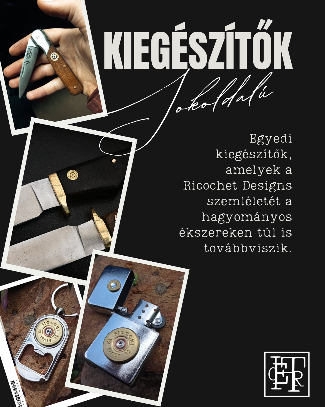
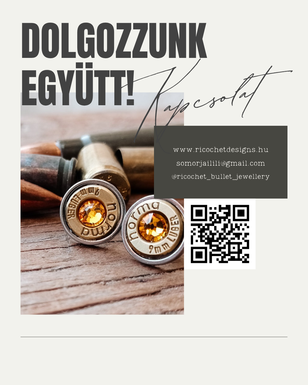
One visual language across changing formats.
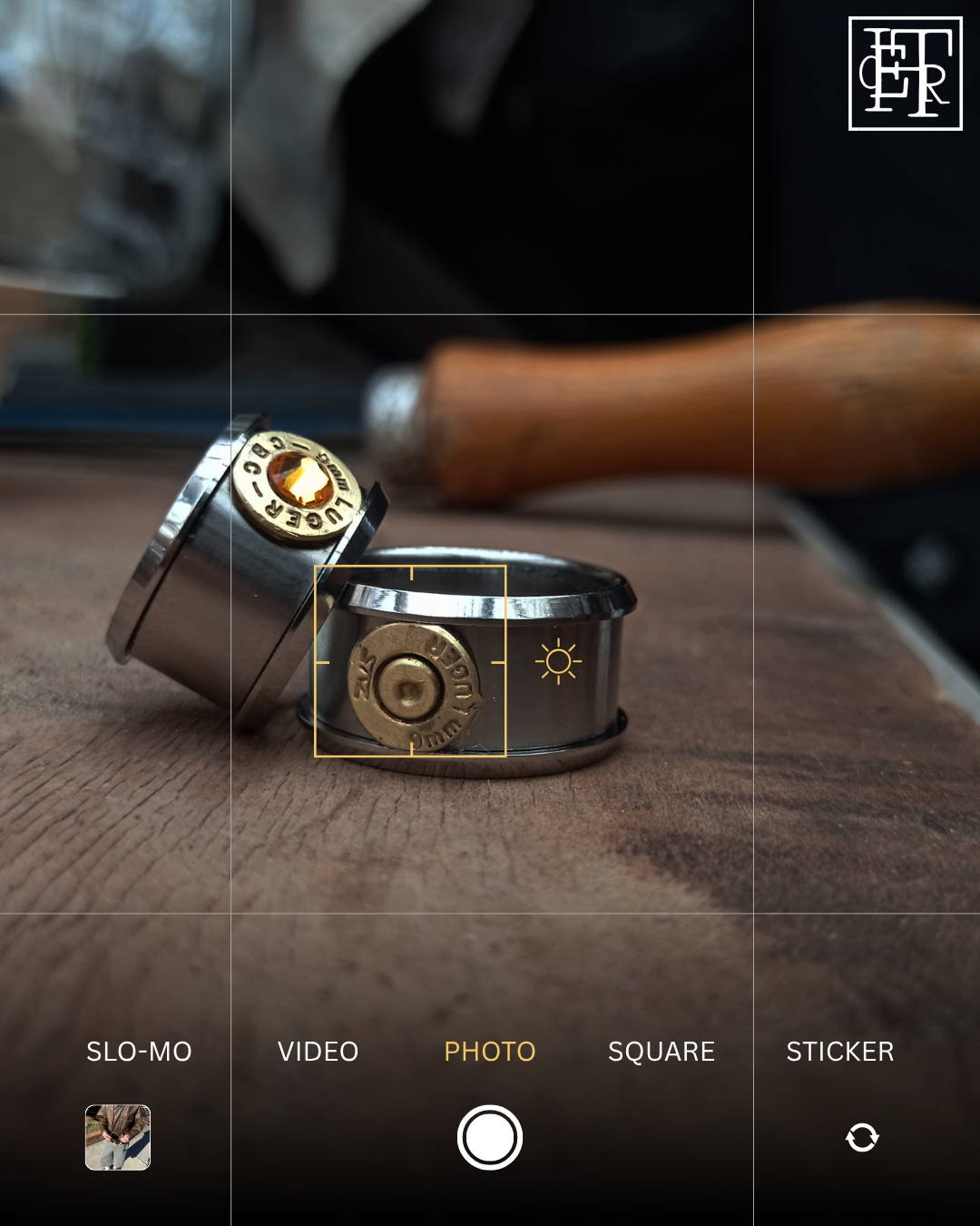
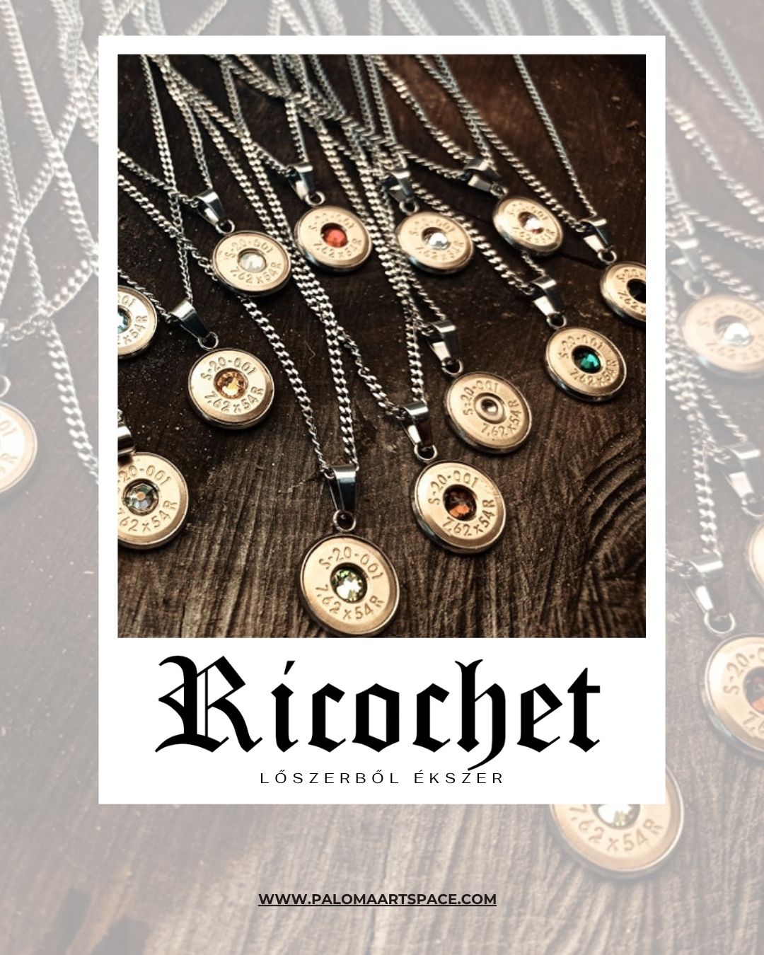
Product-focused posts, category communication, announcements and campaign materials use a consistent typographic and photographic system while adapting to different formats and information density.

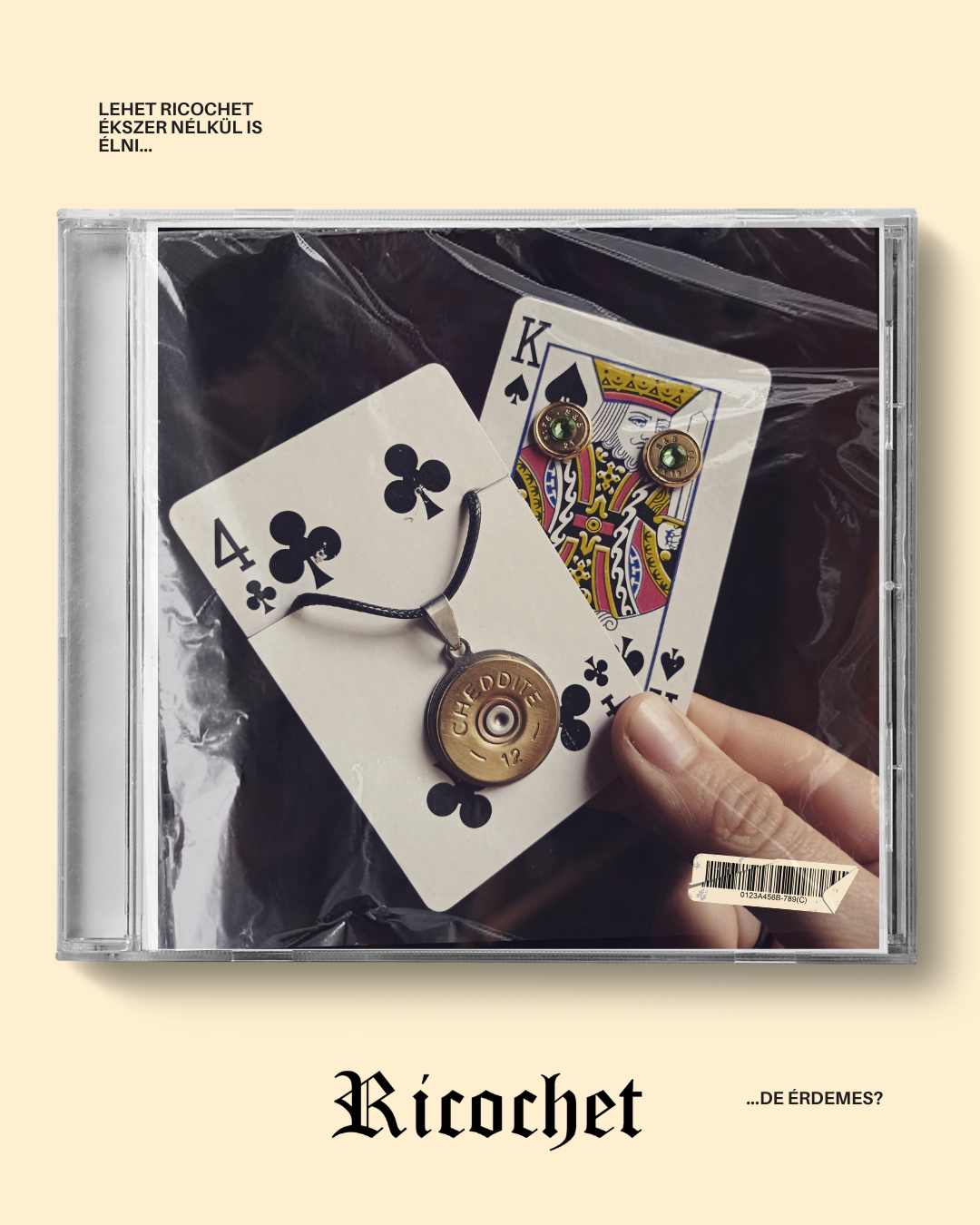
The system also had to support different audiences.
I manage communication for both customers discovering the brand and retail partners representing it — keeping the visual language consistent while changing the level and purpose of information.
Story, product and discovery.
- Product storytelling
- Social content
- Event and retail information
- Website content and SEO
Clear and consistent brand representation.
- Retailer communication
- Product presentation materials
- Brand assets
- Sales-supporting information
From identity to interface, print and communication, Ricochet was designed as one connected visual system — not a collection of isolated assets.